Type: Personal project
Year: 2015–16
I think it was around 2016 when I decided to learn how to solve Rubik’s cube. After about a week of practicing over YouTube videos, I finally solved it for the first time in my life. It then became the game of speed and variety of puzzles. And as I started showing my new hobby to my friends, a few of them suggested that I should make a typography-themed cube.
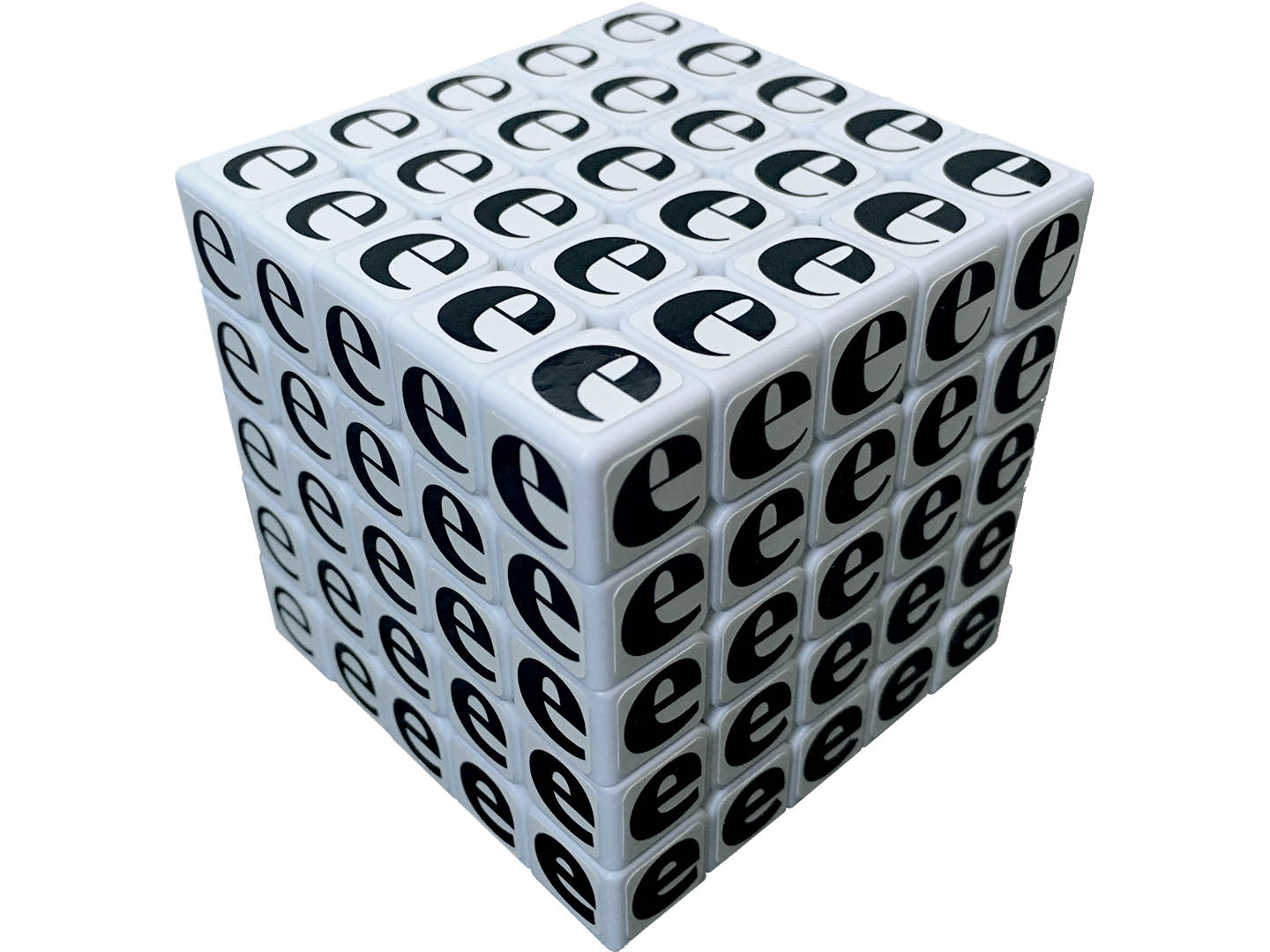
After a few lame attempts, I realised that there was something perfect all along in the type world, called Noordzij Cube. It was conceived by Gerrit Noordzij, a Dutch typeface designer, calligrapher, and educator, in his 1985 book, The Stroke: Theory of Writing. It was a revolutionary diagram that demonstrates parametric transformation of letterforms, in this case weight, contrast, and a way contrast manifests from translation model to expansion one (I leave the detailed explanation to the book which you should read). The idea of giving axes to letters and interpolating new fonts has become increasingly common to a point that dynamic interpolation is supported as a format (i.e. variable fonts).
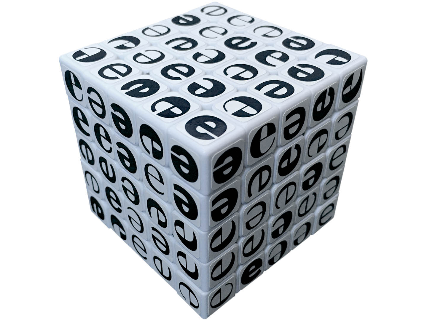
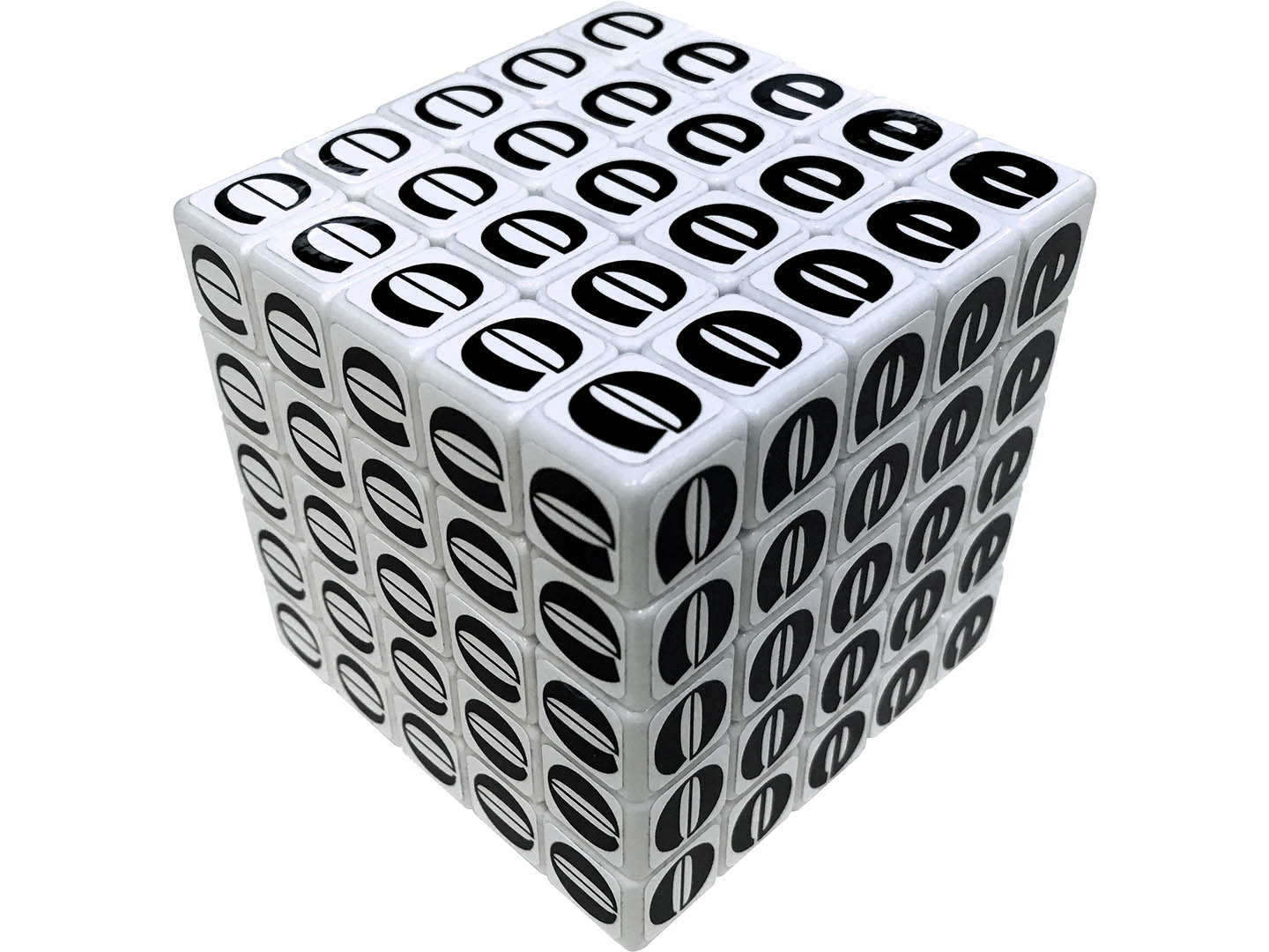
I bought a white Shengshou 5×5×5 cube, removed its stickers, and pasted my own custom stickers that I made using the same Noordzij model. There was a cube sticker specialist in Hungary called Olivér’s Stickers which I used. And the result was unbelievable. However, the stunning sensation of finally being able to hold it in my hands did not last very long, as I soon discovered how it could be even more beautiful when it was scrambled. Of course I had prepared for the challenge of solving it, because each cell of pictured Rubik’s cube now has orientation as opposed to position when it was plain colour. It’s called super cube in the community, and this Noordzij cube is therefore a 5×5×5 super cube (you can find tutorials on YouTube).
A number of variation followed:
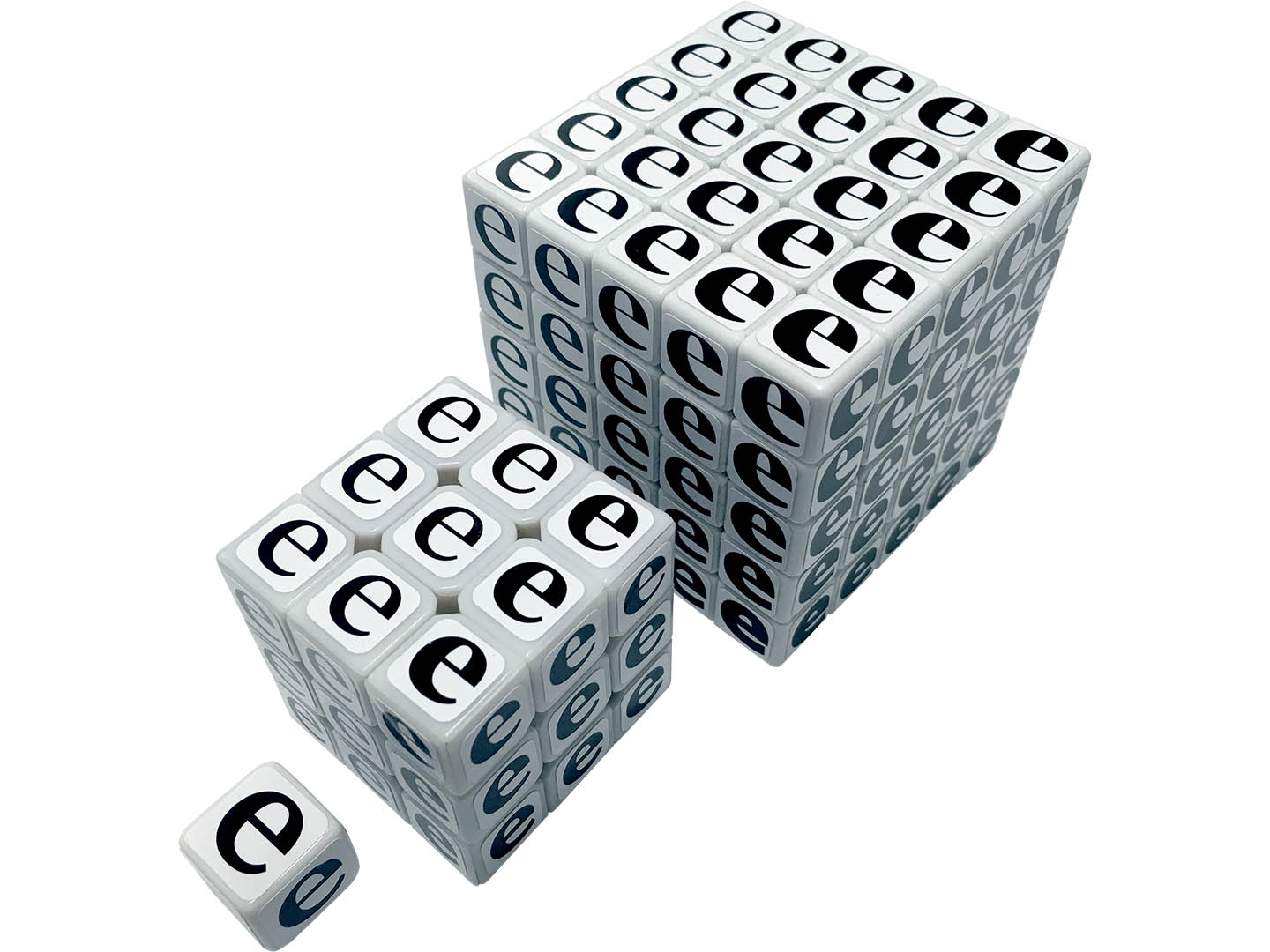
Internal cubes. Rubik’s Noordzij Cube only shows its surface, despite the interpolation space continues inside. I have made 3×3×3 and 1×1×1 core cubes that represent the layers. The 1×1×1 is the most average interpolation that sits in the centre, and not even a puzzle cube.
Reverse contrast cube. At TypeCon Portland in 2013, David Jonathan Ross gave a presentation about typeface with reversed stress. At the end of the presentation, he proposed that Noordzij Cube could have an alternate dimension where the contrast is horizontal. I had to make this one too, and it’s now in David’s possession.
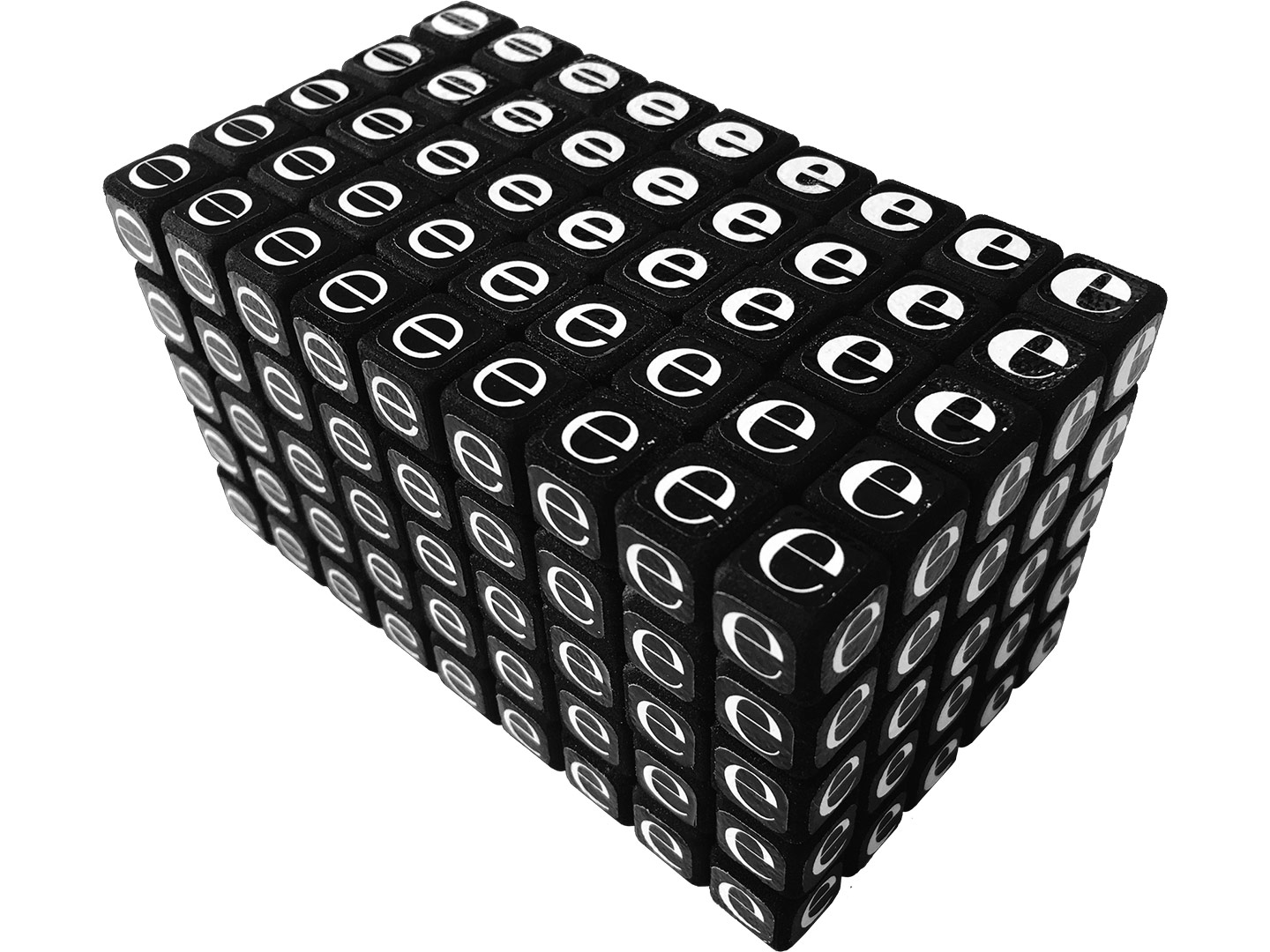
Combined universe cube. Did you know twisting puzzles come in many different shapes, including cuboids that are much longer than the cube proportion? They don’t always maintain the cuboid shape when twisted but start to look more like Bauhaus architecture. I wanted to make a 5×5×9 puzzle which was not available on the market, but thankfully somebody had already figured it out (apparently, cube designing is a hobby among architects and product designers which became even more popular after the advent of 3D printing). I contacted the inventor, Grégoire Pfenning*, to custom-print one for me. The cube I wanted to make was a combination of standard and reverse stress Noordzij cubes that share the zero contrast (i.e. sans serif) in the middle, this time in black so that the white e’s look like the stars in the space. Words failed to describe how beautiful it came out, which you can see in Grégoire’s YouTube video. It turned out that I could not solve this puzzle yet, after trying for 8 hours.
- Grégoire is also the current world record holder of the Rubik’s cube with the most cells, 31×31×31.