Name: After Dark
Release year: Estimated 2022
Author: Liam Wong
Concept, Art Direction: Darren Wall
My role: Cover lettering
Publisher: Thames & Hudson
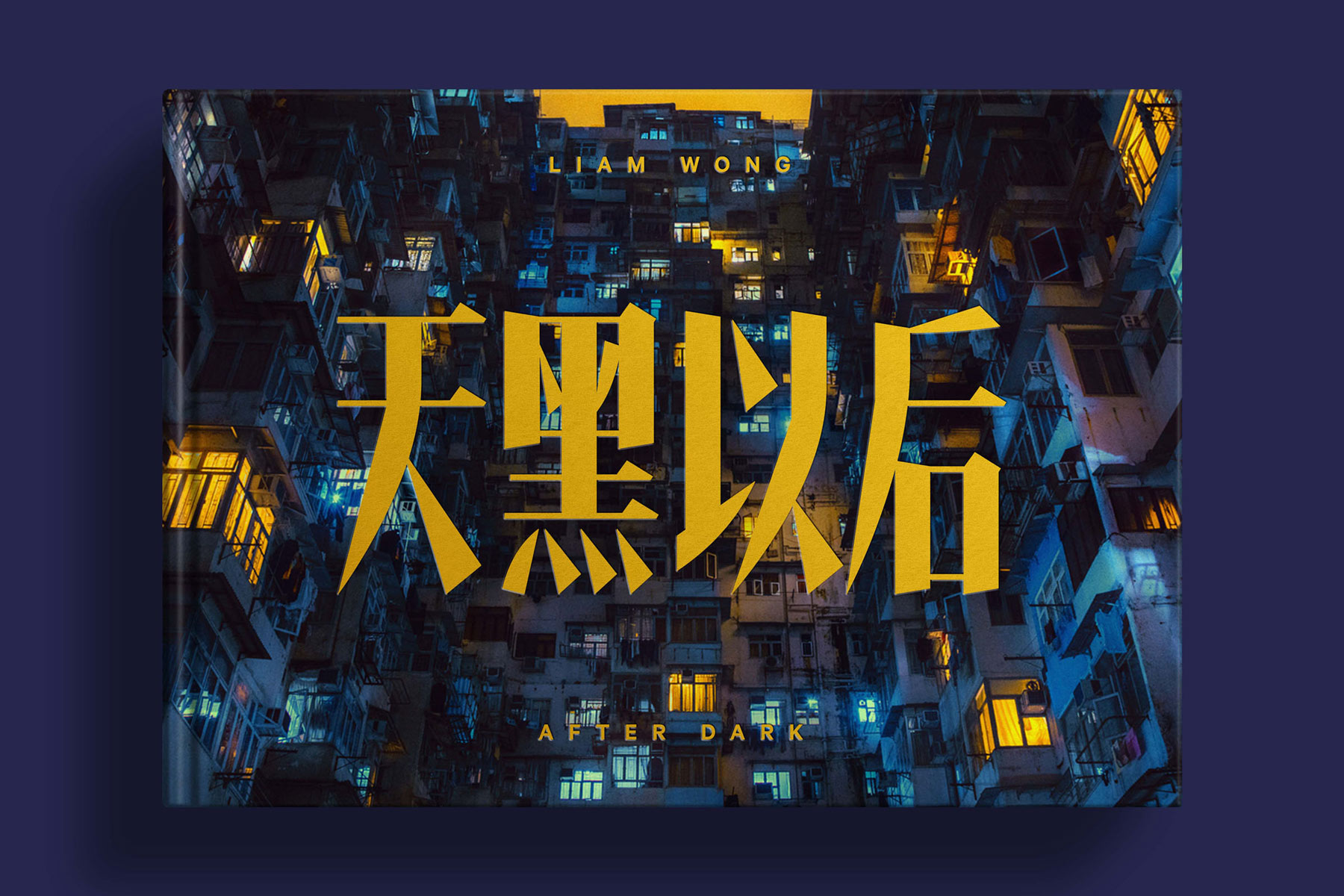
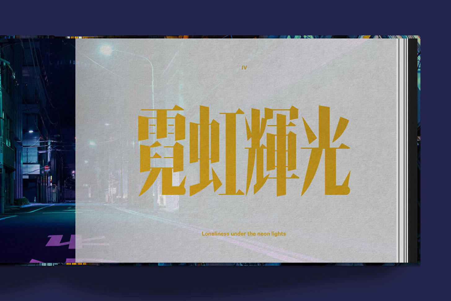
I drew the Chinese lettering of Liam Wong’s After Dark, a photo book that explores the beautiful night scapes of mostly Asian cities.
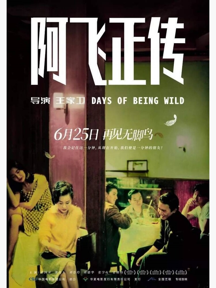
The main inspiration of the brief for the cover lettering was the poster and opening title letterings of Wong Kar Wai’s films such as As Tears Go By, Happy Together, Days Of Being Wild (Traditional/Simplified), and In The Mood For Love. They are generally condensed and stylised to varying degrees and fit the romantic and perhaps nostalgic tone of Liam’s visuals.
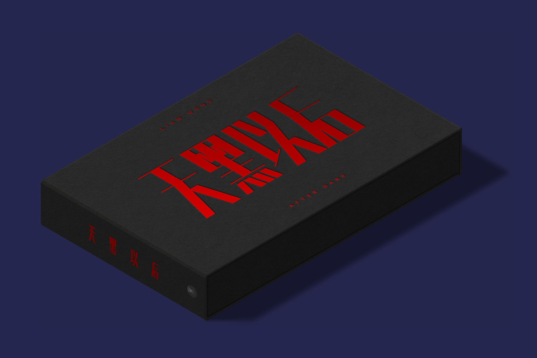
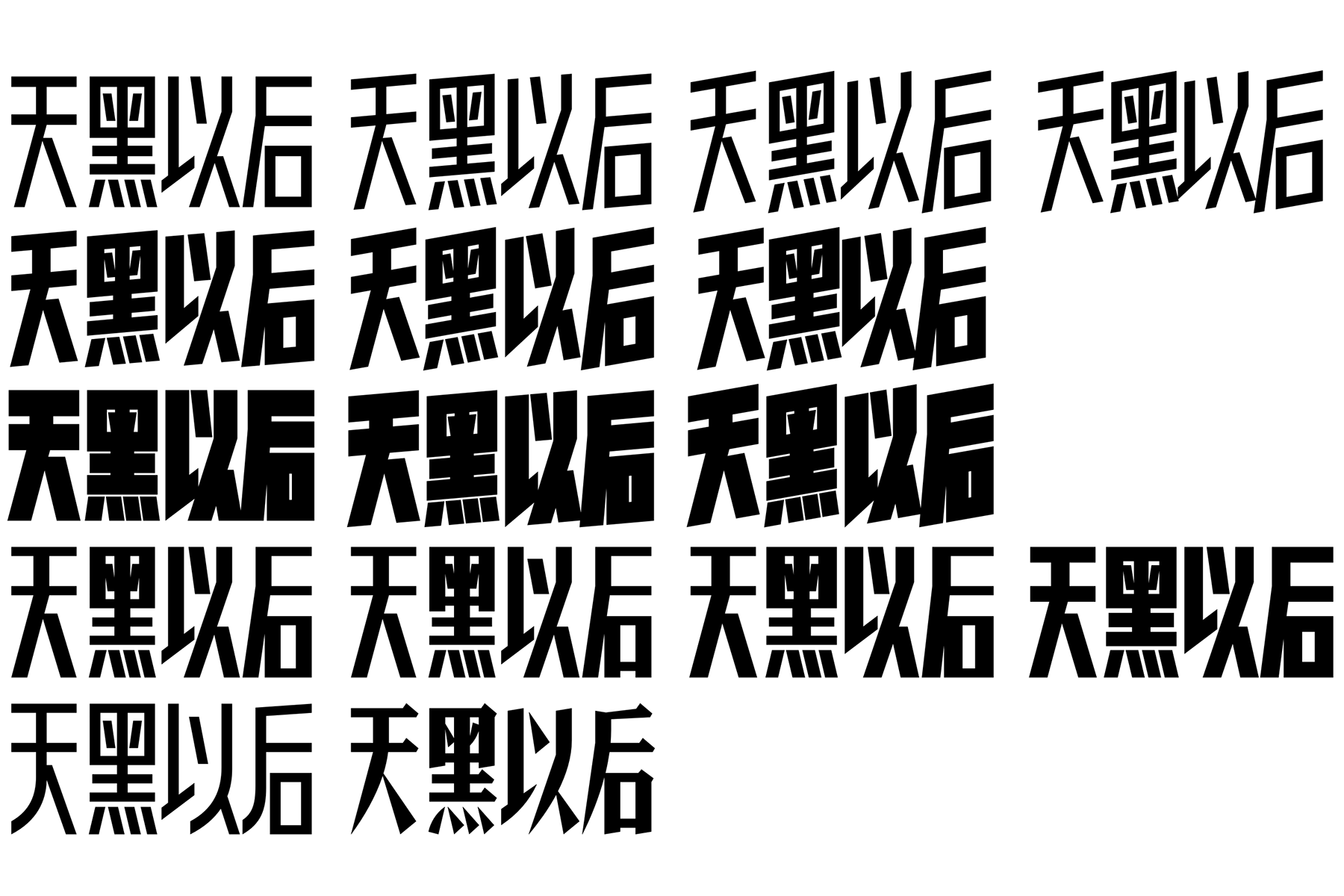
Darren and I were initially drawn towards the opening title of As Tears Go By, which is a ‘sans serif’ style (Ch: Heiti), slanted vertically, and red on black with a small English subtitle. Of all the initial sketches, I drew the most variations in this style. In the end, it was decided that the shapes and colour choices were perhaps too simple and strong and not quite representative of the content.
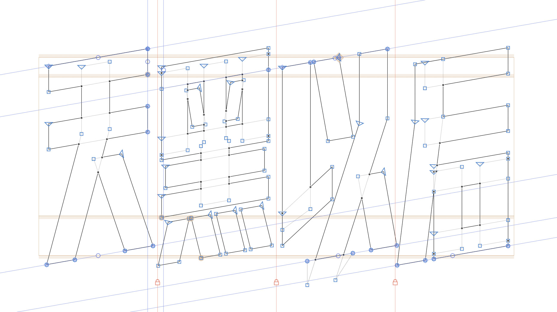
In the next round, we drew inspiration from the ‘serif’ style (Ch: Songti) seen in In The Mood For Love. The precise contrast of thick and thin strokes needed to be determined, and I sent Darren a bunch of different thickness options in the previous round, but I wanted to do it better this time. I made a variable font which let you choose the precise weight using the slider instead of the traditional style submenu. Variable fonts are popular in web design but are also helpful when prototyping.
In the end, two high contrast styles were chosen: the Songti one for the standard cover, and Heiti for the Collector’s edition jacket. I think the final cover design beautifully balances the source inspiration and modern sensitivity.