


Name: Inkulinati
Type: Custom typeface
Client: Yaza Games
Release year: 2021
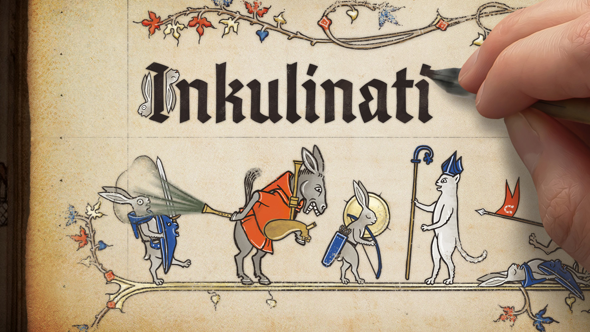
One day, I got an enquiry from Yaza Games, who were making their first game, Inkulinati. It is a lovely turn-based strategy combat game that uses illustrated animals from mediaeval manuscripts as your minions, and is perfect for type people like myself. The game started after the successful Kickstarter project, and is due for release on PC and consoles.
I fell in love with their project immediately and offered a custom typeface for them. The game uses two typefaces: one for smaller UI elements, and another for anything larger from body text up to the logotype, effectively the main typeface. The latter was going to be a blackletter, and I was going to make it.
Indie games champion themselves over big corporate ones in uniqueness, and font choice contributes a lot to their visual identity. Typography for videogames must clear three design criteria: style, legibility, and multilingual support (especially Russian); non-design criteria are price and embedding license. In video games where historical and fantastical aesthetics are rather common, blackletter is not an unusual choice. However, not many blackletter fonts tick all the checkboxes, especially the Russian support.
I started research on the mediaeval manuscripts on online resources for the calligraphy styles in the 13th century, a period in which the illuminated manuscripts were popular. Even though some forms of blackletter existed in the 13th century (textura and rotunda), it quickly became apparent that it would be a bad idea to simply digitise their letterforms, since they didn’t look particularly legible to modern readers, and thin hairlines wouldn’t render well at a variety of sizes on a digital screen. In addition, the capital letters were quite large on average and would waste the screen space if they were used in the game.
The design direction of the new typeface was influenced instead by legibility, text length efficiency, and Sachsenwald typeface, Yaza Games’ previous choice for the game (also my typeface, the reason why they contacted me). The result is a simple 20th-century design that is not too dissimilar from those by Rudolf Koch and Berthold Wolpe. Its lines are mostly curved to give a more hand-crafted look, and thin hairlines are removed to ensure the letters stay legible at many different sizes on a digital screen. I particularly struggled and enjoyed drawing the lowercase a; its rather unusual structure can be found in the 13th-century writing, and still looks unmistakably like the letter. And it comes with Cyrillic, a rarity for blackletter.
With the wonderful enthusiasm and understanding of Yaza Games, I managed to make a typeface that has a unique voice and is fit for purpose. Having said that, they kindly allowed me to publish it in the future. I cannot promise when, but watch this space for the release!