Ink traps and pals
03 April, 2021
Recently I’ve seen this tweet from Yves Peters asking how to call these spikes which I replied briefly (spoiler: it’s a light trap!). I had a lot more to explore on the topic, so I decided to write not just about light traps, but similar concepts and shapes too. There are days in life of typeface designers when they want to write 4000 words about these things with no regards to conciseness.
Ink traps
The general idea of ink trap is enhanced edges of inside corners of printed graphics. You might see them in typefaces, as well as logos intended for printing. It is a solution to suboptimal printing conditions in which a larger area of graphics (e.g. line intersections) could result in ink smudge. If you want to minimise the effect, you counteract by shaving off the mass around the problematic part. This technique is the ink trap.

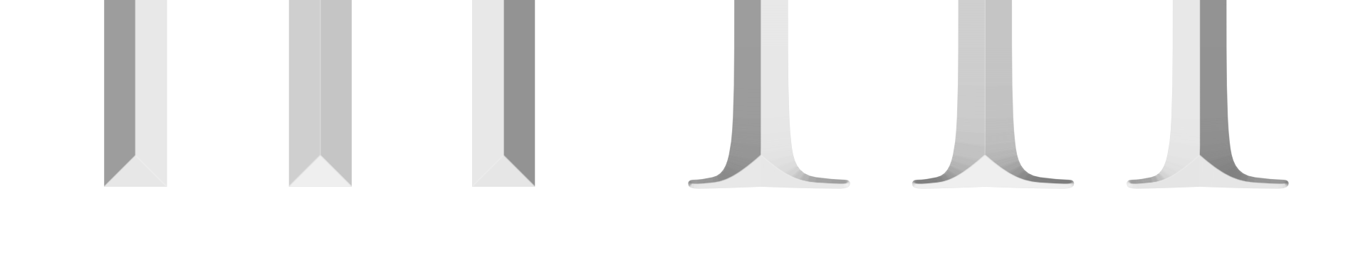
Intended shape, what will happen in bad/small print (notice the thickened centre), and ink trap
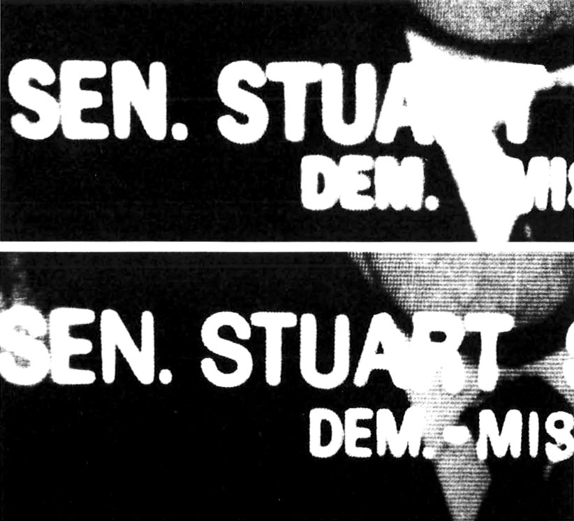
In typefaces, the best known example of ink traps is Matthew Carter’s Bell Centennial. It was released in 1978 for phone directories with the intent to typeset directories at much smaller font size than before, thereby reducing the papers needed to print the same content, and ultimately printing cost. It is not simply a matter of choosing smaller font size though, since the phone books were very cheaply printed on very cheap paper, and letters would easily be smudged to the point of illegibility if you didn’t counteract. Carter’s solution was to cut the inside corner deep. The typeface looks super odd compared to the original Bell Gothic but works like a charm when printed at very small sizes like 4 to 6 points. It is intentionally imperfect at the outline stage, and counts on the bad ink to do the final touch instead of complaining about it. It’s a masterpiece that teaches you the attitude of a pragmatic designer.
You can learn more on Bell Centennial in Nick Sherman’s article.

Bell Centennial Name & Number
Bell Centennial in use in a phone book. Image courtesy of Nick Sherman.
Another example is United Nations emblem. Its problem is the complexity of the world map is being used like a regular logo, and it’s not going to look good at small sizes. I would imagine earlier computers might not have been able to process the small islands and make lots of designers cry. Except that is probably not what happened by large, because the alternate, simplified version was made. Maxim Zhukov, who is known among typeface designers as the OG ambassador of Cyrillic type design, designed the small version of the UN logo in 1991. It reduces the number of islands, removes altitude/longitude lines where things would be crowded (notably the Timor Sea in the north of Australia and Gulf of Mexico), and of course ink traps. People with less understanding of design might criticise the lack of accuracy, but it was never intended to be used at a size where you could count individual islands.

UN logo taken from Wikipedia.
Maxim Zhukov’s version. It’s probably someone else’s crude tracing, but preserves the original intention well enough. Given that the UN logo is used in white on blue too, wouldn't that technically necessitate reverse ink trap version as well?
The two versions of the logo in tandem: full version is on the flag, and the small version is on the wall.
Small version being used at a large size. Brits and Italians might complain that their lands are missing.
In fact, there are infinite variations of the same logo depending on the scale and production method. Even the one on Wikipedia appears to be a manual recreation. The map is only to be taken as an idea, rather than the literal representation.
This UN emblem badge features understandably a super-simplified map. It’s not an official item but even an official one wouldn't be that much different.
Ink traps in various forms
I said in the second paragraph that the technique is the ink trap, not the shape. That’s because there are numerous shapes with the same intent, and numerous intent with the same shape. And I prefer to categorise them by intent. That’s what this blog post is about. As long as the goal is to reduce the ink smudge or count on ink to fill out the intentional blank, I think they all can be ink trap regardless of form.
Ecofont, made in 2009 by the Dutch design firm Spranq, is a Vera Sans with holes in the middle with the aim to reduce ink. The text may look slightly lighter or you might notice the holes when used at large sizes, but it apparently reduces the ink needed to print the same text set in Vera (hey, maybe the circle size could be a variable font idea). It claims to save ink and your wallet, except it’s not free; I am not sure how many prints you need in order to justify its annual subscription price of €7 in order to make a difference, but I would imagine quite a bit more than an average person needs to print. By that point it’s probably more economical to not print at all. Cool design idea though!
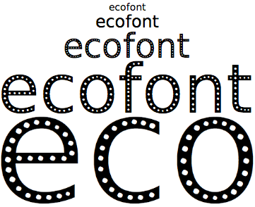
Ecofont. Image from Ecofont’s Facebook page.
Ryman Eco, designed by my former boss Daniel Rhatigan while he was at Monotype, was made on the same client brief to save ink but attempts to make it look great at large sizes. It’s drawn from scratch and incorporates the ink reduction tactics as core of its design. I think it is more useful as a display face not because it performs poorly at small sizes, rather largely because of the brief that’s perhaps too ambitious.

Ryman Eco. It’s a free font, so go get it and tell Dan it’s awesome!
These eco fonts that aim to cut down printing ink, as well as the school student’s famous ‘discovery’ in 2014 that thinner font at smaller size uses less ink (read more) all have the same problems. One is that home/office is a less-controlled setting compared to that of Bell Centennial where the designer knew exactly how the typeface would be used. People use fonts in all sorts of sizes and ink printers as well as laser (toner is a dry and powdery substance that does not behave in the same way, and the ink traps won’t work the same either), and typefaces aimed for such specific circumstances usually don’t survive that level of abuse. It wouldn’t take much time until you simply stop using it. Second is that ink is a smaller part of the equation when talking about printing cost, and reducing paper is more effective. In type design, that means to make more legible and efficient typeface that can pack more letters per page. After all, that’s what Bell Centennial was doing; it was not designed to reduce ink but paper.
But Ecofont and Ryman Eco do bring up excellent points. You do not have to reject calling them as ink traps just because it doesn’t look like spikes. It’s intent that matters.
The Origin of Ink Trap
According to Google Book’s Ngram Viewer, the combination of the words ‘ink trap’ date back to around 1860s, but not for typography (e.g. a patent for a pen). The earliest I could find in the search was 1931, from the advertisement for Linotype Excelcior in the American printing industry journal Editor & Publisher, volume 64, issue 15, pp 26–27.
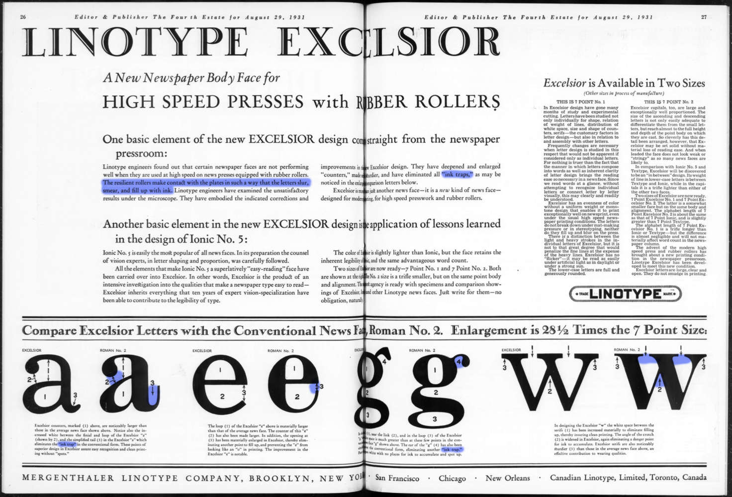
Spread from the Editor and Publisher. According to the text, ink traps are the semi-enclosed areas where ink could clog up the rest of the internal counter (blue), and the foundry was proud of their absence in the new design. Image from archive.org.
You can see that the term ink traps were not entirely new at this point, and more importantly, it was referring to the problem, not the solution. It’s an interesting revelation, but I will stick with the way we use the term in order not to confuse the reader.
Light Traps
Are you with me so far? Good, because I’m finally discussing Yves’s tweet.
Late 20th century was the age of phototypesetting era when we stopped using metal type but used cameras, lenses, films, and offset printing instead (it was short lived and replaced by computer after a few decades in the West). The reproduction process posed new problems that came more from the film part on top of inking; you take a picture of your finished design to a film, develop that in a special liquid to stop the film from further reaction to light, and turn the developed film into a sheet of metal plate that has your graphics to be printed. Your text could be blurred and rounded by the lenses being out of focus, or films being underdeveloped (other distortions include shearing and warping).
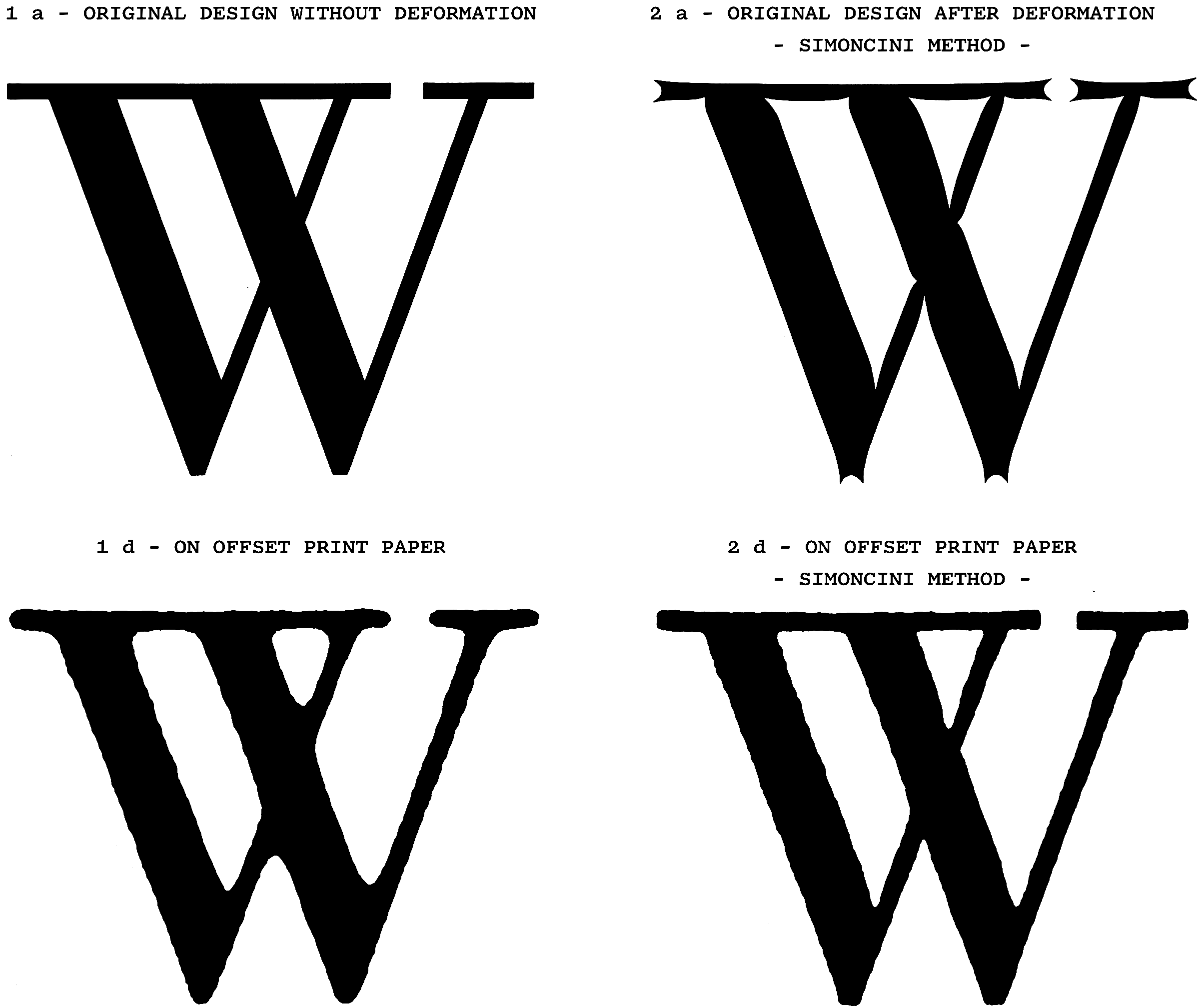
The Italian type manufacturer Officine Simoncini patented their light trap technique in 1963, dubbing it Metodo Simoncini. The patent document shows how the spikes preserve the intended shape better. The caption is translated to English by myself. The Simoncini Collection, Museo del Patrimonio Industriale, Bologna. Image courtesy of Antonio Cavedoni.
To compensate for rounding, you can preemptively make a typeface extra-sharp in the corners. That’s what these white spikes/thorns are for in the Neue Helvetica for phototype. This bings up a question of it being used in a larger size now that you could scale one master drawing; there were companies that offered multiple optical size options, or I would imagine that if any typeface was to be used at such size you could notice the spikes, the typesetters would surely be able to touch them up on the spot.
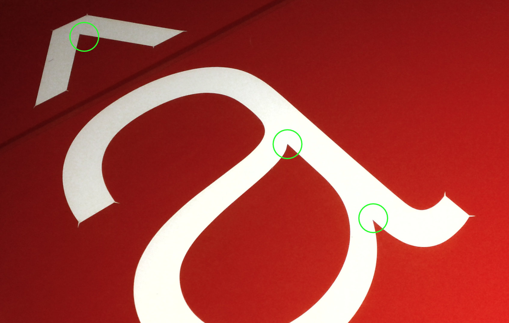
Neue Helvetia frisket. Green mark highlights the inside corners that lack spikes.
The above Neue Helvetica master frisket (see it on Wikipedia for full image) curiously misses inside spikes, despite that they should be present both inside and outside unlike ink traps and other companies like Simoncini were already doing both. This is a compromise due to the way these masters were made: you would stick a transparent film with Rubylith, a red layer of masking film to be cut away in the negative form of letter. This would allow the thin red piece to be removed, but not left sticking out which would break off easily. There were other ways of making masters including photography; this way, the thorns were printed images rather than physical piece of plastic. They seem to have been internally referred to in a variety of names like thorns and spikes, but my favourite is bitten crotches.
.jpg)
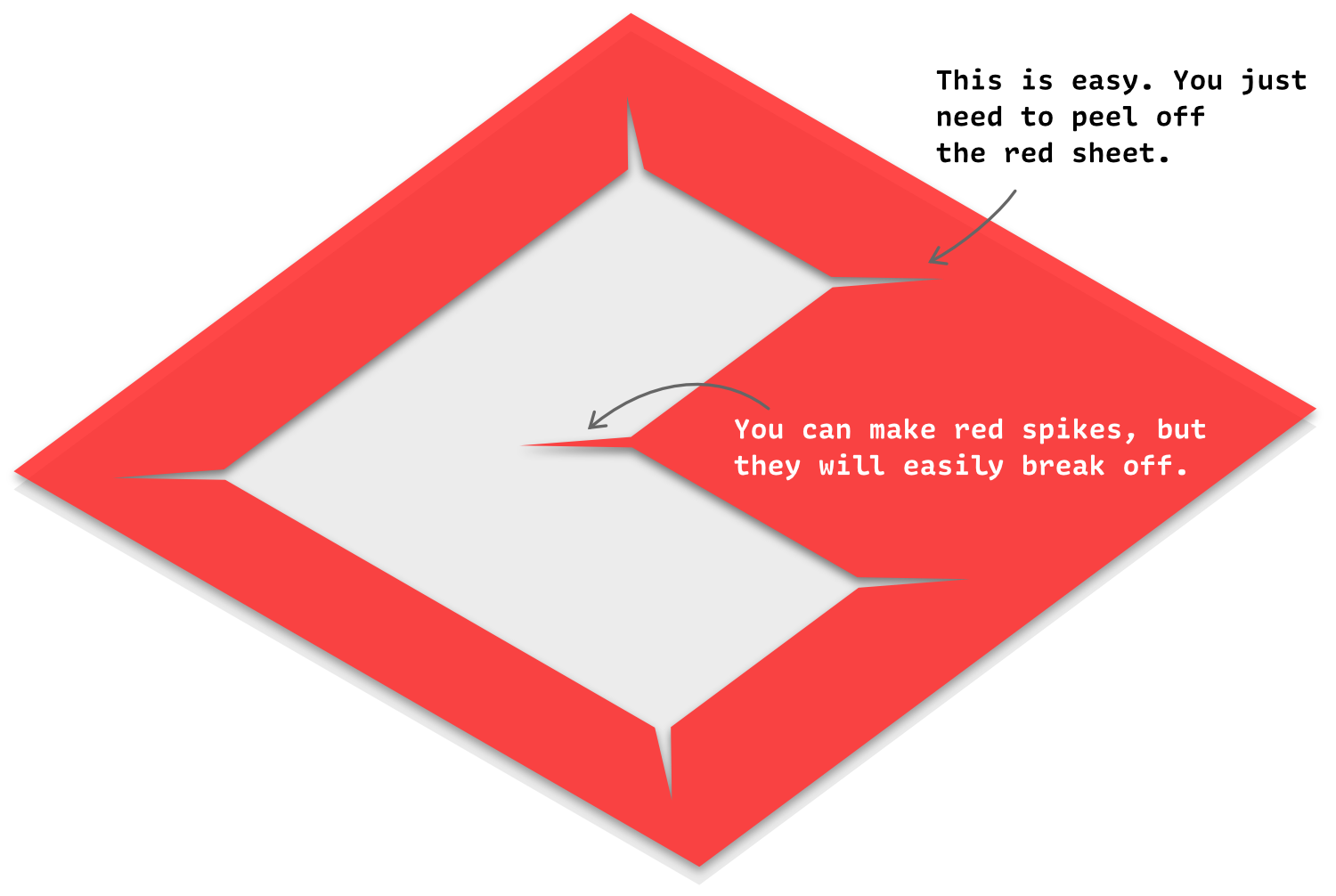
One weakness of the Rubylith masking film method.
The film master of Haas Unica featuring light traps on both inside and outside corners. The letterform is printed instead of cut away. Image taken from the now deleted article New from old: the why and how of reviving a typeface, Monotype blog
By the way, don’t those spikes look like serifs? I think so too. In fact you could argue that the serifs, originally applied to inscriptions to be seen under sunlight, could be a form of light trap, even though people in the Ancient Rome wouldn’t have such terminology. They would have wanted to make the letters stay legible for as long as possible in the day, and serifs are more effective at keeping corners dark at variety of light angles than serif less forms. (I do not know how old this argument is, but it certainly didn’t start with me. I really should read The origin of the serif by Edward Catich and Politics and Script by Stanley Morison to properly cover the topic. As for the former book, I tried but could not stand reading in Linotype Baskerville.)
If you’re with me on the theory, you could say the W illustration from Metodo Simoncini has double light traps!
Helvetica and Adobe Trajan in simulated inscription under different light angles. The advantage of the serifs is more pronounced when they are shallowly chiselled, which Ancient Roman inscriptions typically were.
Going back to the topic of photorype light traps, Shaken, the Japanese phototypesetting company, also employed the light trap technique, which is more pronounced in their earlier designs. They did not apply the trick to the outside corners, except when they ported Univers from Haas and decided to keep them after much discussion, but much smaller than the original. They had two separate terms for inside and outside emphasis, sumitori (隅取り/墨取り) and kadodashi (角出し), the latter of which probably weren’t popular until they had to port Western faces.
Iwata Shinbun (News) Mincho, product code ISNMKLB. Photo courtesy of Shigenobu Fujita.
‘But why combat rounding? Why don’t you make it a feature?’ thought Gerald Unger, when he designed Demos and Praxis for a digital phototypesetting system called Linotype Digiset. They keep the appearance consistent at all sizes by rounding corners by design, and does not pursue the depth of notch in the lowercase letters.

Demos and Praxis in their original forms. Image courtesy of Typotheque, and re-drawn by myself.
On-screen Light Traps
Broadcasting on CRT, especially in colour, was a tough challenge as it got blurred all the time due to light smearing which tended to make white strokes larger and scan line distortion that tended to emphasise horizontal strokes (similar to horizontal motion blur), as well as magnetic distortion on the viewer’s displays. The popular typeface in the American broadcast industry was News Gothic for good legibility rate on screen and text length. In order to improve it, Rudi Baas at the Graphic Arts Department of CBS, the American broadcast network, made a sans serif typeface to be used on screen in 1967 (the see Visible Language issue 4, article 23). After much experimentation particularly around the corners, the team ended up with round inside corners (Baas called them lacnae. He also decided against outside corners since they were more obvious). This was for white on black text, and the black version has no traps and is thicker, unlike printing where white-on-black version would have to be thicker.
CBS News 36; the number refers to scanning lines. Image from Visible Language where you can see the full character set.
Top: News Gothic Bold.
Bottom: CBS News 36 whose letter spaces and counters survive much better, though that’s due more to stroke thickness and spacing. The effect of light traps can be seen inside T. Image from Visible Language.
Nick Sherman’s Rudi (design in progress) is a revival of CBS News36, a faithful one at the point of writing this article. Also recommended on the subject is Briefcase Foundry’s article on Czech broadcast typefaces.
AR and VR are brutal environments where pixel grid does not stay upright at all and letters are almost always diagonal, skewed, and in motion. Niteesh Yadav’s Reading MATD typeface ARone combats the issue by adding sharp edges both inside and outside (Unger did show him Demos during the course, but Niteesh says his M.O.L was more relevant. 1 2). They technically fit the description of light traps since it wants to enhance the edge and it involves light, except the shape and light interact in different ways between photograph and LCD, and not all digital displays emit light. Pixel traps would be a more precise and pedantic option. I'm not married to the term either way, just suggesting other ways to describe.

All ARone features cut-ins, and Sans have subtle flare serifs. Image courtesy of Niteesh Yadav.
David Jonathan Ross’s Input is another example whose large notch is clearly a digital light trap. Its Regular weight was drawn over 11 pixels height and 7 pixels wide body with the stroke thickness of 100 units (the UPM is cleverly set to 1100). Ross wanted to make sure that there is a notch of white pixel between shoulders, bowls, and stems, and came up with this large square notch that is exactly 100 units deep; the number is why I have little doubt about its purpose. I guess the notches could go deeper, but that would end up breaking up the strokes.

I love clearly defined briefs, and love how Input’s design concept and detail-level decision is governed by one particular pixel size.
Corner Cuts
In the times when Bézier curve rendering on computer screen was still in its infancy, there were sometimes cases where outlines would burst out from the very sharp corners because the engine could not calculate the trajectory precisely enough. The type design solution was to trim the tip of the corner.

My recreation of the outline explosion problem: the top is intended, and the bottom is the failed rendering caused by the notch. People who have spent their time long enough in the type industry might have seen something similar from FontLab 5.

Lowercase n from the digital version of Helvetica. My understanding of this corner cut was the practice to prevent acute corners from exploding.
Such errors are things of the long past, but the treatment hasn’t lost its usefulness, as it’s still an effective countermeasure to the outline effects which can sometimes be crazy. In technical terms, you essentially embed miter limit in the outline. Subtle rounding is the same solution applied to the whole typeface, which can be seen in Akira Kobayashi’s works like DIN Next, Akko, and Between (He told me that the outline effect is incidental). Blunt corners are also less harsh to human eyes, especially those with needle phobia.

Shapes with corner cuts do not get spiky when outline effect is applied without tweaking outline attributes (middle). The right is subtly rounded, which makes the outline effect always soft.
They seem to be often described as ink traps, but I prefer corner cuts because that’s all it does. It’s not an ink trap because it does not try to reduce the ink. Nor is it not light traps since it doesn’t emphasise corners.

Is it about reducing black chunk or preventing the notch from going too deep? The latter is corner cut, though the answer is rarely binary in practice.
Tear traps
Thin sheets are prone to tearing and cracking when bent, especially when there is already a slit. The common way to prevent it is to punch a hole at the tip of the slit. This is the purpose of the hole in fountain pens and reed pen, to relax the tension caused by the slit and prevent from cracking further. The shape is usually a circle because it’s made by punching or digging later in the production. Note that the term tear trap is my invention for the sake of consistency in this post.
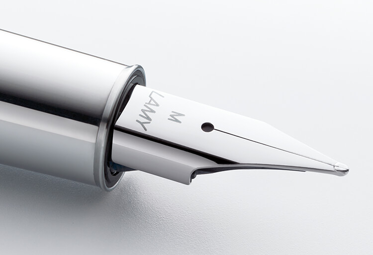
The hole for fountain pens has two functions: to let air in so that ink can flow out of the tip, and to relieve structural stress coming from the slit, which is more critical in reed and bamboo pens. Image taken from Lamy website.
This is the least common in typefaces which are not expected to be produced in physical sheets very often, if at all (though CBS News 36 accidentally qualifies). In fact I only know one example, a logo from Musashino Art University in Tokyo, designed by the late Mitsuo Katsui. The little holes in the inside corners, and conveys structural robustness. The poster by Minoru Niijima demonstrates the idea effectively in this poster. I would be a wrong person to be critical here, because I was a student of Katsui and Niijima and admire their work greatly.
Musashino Art University logo.
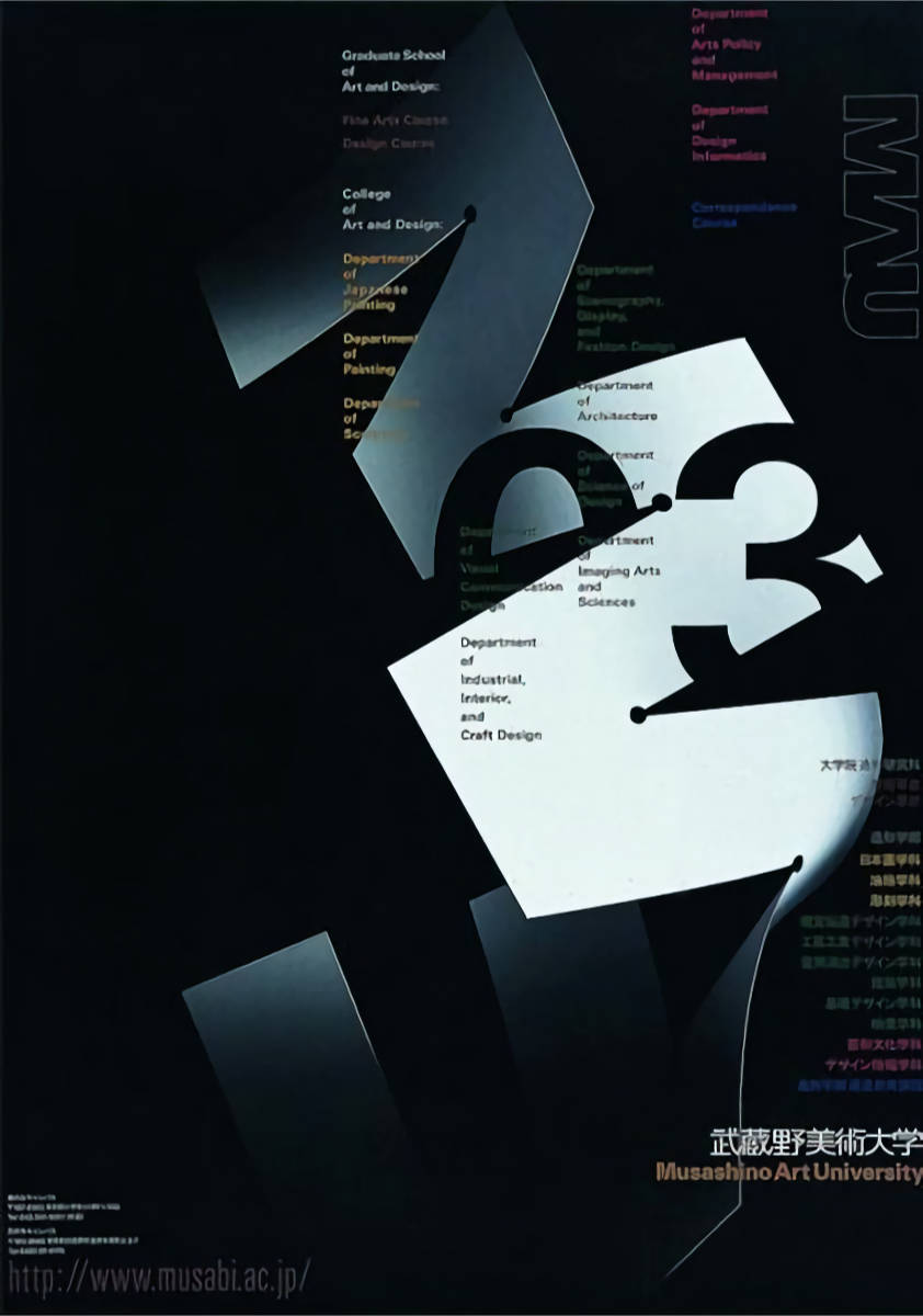
The university poster by Minoru Niijima.
Contemporary traps
Even though these traps had different purposes, and even though many of these problems are obsolete, the resulting shapes can be useful on their own. Letters like M and W have lots of joints which can look visibly heavier because of the mass there. You can reduce the black spots by spacing out the strokes, making the letter wider in the process, or cut deep into the joints. The latter is similar to typical ink traps, but the issue it addresses is optical in nature.

The leftmost M has large chunks which stand out like spots in text, and you want to break them up.
Beyond solving practical issues, ink traps can be simply cool. Bell Centennial was sometimes used in large sizes because of the unusual details despite its original intention but much to Carter’s delight. And now we have quite a few typefaces that explore the interaction of white shapes for display use, such as: Minotaur Beef, GT Flexa, Whyte Inktrap, TT Trailers, etc. (find more at Fonts In Use). More down-to-earth descendants of Bell Centennial such as Gemeli Micro, Retina and Trench look like they anticipate display uses too (certainly the latter two). And as much as it can be too gimmicky, I would love to see more unconventional shapes like aforementioned Rudi and Heavyweight Type’s AVU custom face 😍. In a way, ink traps are becoming the serifs on the inside, gradually forming the mirror universe of the serif category.

Whyte Inktrap by Dynamo Typefaces.

Academy of Fine Art in Prague has been using the lion logo filled with hearts since 1990, as does their new branding typeface in the form of ink traps. I like its passing resemblance to the Czech caron/háček diacritic. Font courtesy of Heavyweight Type.
Sans serifs are undeniably popular nowadays, but the blunt look of traditional sans might appear too boring to modern eyes who still want a sparkle of details but without adding serifs. Like I drew the analogy between light traps and serifs, I see ink traps as a new form of serif but on the inside. We may look back on this time when the idea of alternate universe serifs were still in its infancy and our Latin type classification system may have a subclass descriptor of ink trap shapes.
Conclusion
Despite all the pedantry that I threw at you (thank you for reading this far by the way), these distinction matter mostly when you discuss past examples or specific intention. I won’t come at you with a pitchfork when you use ink trap as a blanket term, but I do want you to be aware of the things you are making and why, especially when they are trendy. I hope I gave you something to chew on, and ideas for future typefaces.
Bonus: Imperial Traps
Let’s imagine that you are a white male supremacist and have problems with united diversity. You invite them to your home and block their escape. Except your strategy will be disrupted by a bunch of Tibetan-speaking teddy bears.
That’s a deep cut.