Book review: Type Matters!
10 May, 2012
This book made me furious. In case you don’t want to read the whole post, here’s the summary.
This book is an ‘introductory’ book for typography learners, but contains a lot of false information. It’s not like the author made too many mistakes, rather he simply lacks knowledge. To give you one example, in the final chapter, Glossary of terms, 34 entries out of 94 are either wrong, insufficient, or unnecessary. Simply put, one third of what he tells is unreliable. This is a nicely bound book with some lovely illustrations, but do not be fooled by its welcoming appearance. It will teach you wrong things.
When I first saw this two weeks ago I was just fascinated; a journal-like binding with two nice bookmark string in red and black, and nice big text type (which I found too big later). I bought it soon after that and started reading, expecting that it would read just as good as it looked. Given that this was a big book with 160 pages and I’m not a native reader, I thought I would take a while to finish it. All those expectations fell flat.
This book was written by Jim Williams, a freelance graphic designer and a senior lecturer at Staffordshire University, who started his career in advertisement typography. As it turned out, his knowledge is biased on that background, and wrong. This is also why, as he mentions his love for big type, the text size is just too big to read. But there are also his own issues that might or might not originate in advertising career.
There are several major problems with this book, and I’ll explain from the biggest ones.
Structure
First of all, this book does not have a clear flow. There are three major chapters, first of which is about typeface, second the display typesetting (which is the shortest, consisting of only 12 pages), and finally the text typesetting. The first chapter is ok but the second either tells the same thing in the next chapter, things that are better be put in the next, or the one that is too trivial to mention. That trivial section (2-6) talks about the dots of i and j looking too high when text font is used in the display size and advises you to lower them down. That should be talked in a perspective of overall spacing, with text setting in comparison. You see, he fails to tell a bigger picture already. This chapter should be discussed in a more important context, and AFTER the basics (i.e. text typesetting).
Unfortunately however, that basic chapter is completely a mess. It’s like he just drops whatever he happens to know at random. In the first section (3-1) he talks about font selection, and much later (3-24) he also talks about script font, which sits between Capitals and small caps (3-23) and Parenthesis (3-25), or in other words, middle of nowhere. I wonder why he did not discuss these two in the same section. There are two sections talking about numerals (3-5 & 3-12), 25 pages away from each other, that are more or less the same thing, the former of which sitting between Kerning (3-4) and Letter spacing (tracking, 3-6). Each section does not contain much text, so this book made me feel like I was looking at a bunch of awfully-organised lecture slides, which was what it was originally, without his narrative.
Use of terms
There are lots of wrong or poor description of terms. Most of them can be seen in the appendix, Glossary of terms. By the time I was reading this section I got so furious that I grabbed a pencil and started nitpicking the wrong, insufficient, or unnecessary descriptions (by the way I had never written anything on a book until this time, regardless if I owned it or not). As a result, I marked 34 of them out of 94, which means 36% of what he tells is bullshit. I wouldn’t call it a bunch of mistake. It’s nothing but a lack of knowledge. I picked up some and put them at the last of this post. Oh, by the way the author mentions backslant style way too much.
His categorisation of typeface is awkward too. There are six typeface categories in this book, which are blackletter, old style, transitional, modern, slab serif, and sans serif. You may be wondering why old style, transitional, and modern cannot be merged into one. Well, because Roman is only an upright form of a typeface, so he says. You may be also wondering why sans serif cannot be subdivided or why script category does not exist. I do not know why, but probably because he wanted to put everything in one spread while using huge type size, and there was not enough space to put other categories (remember, he is an advertising typographer!).
Bad illustration
I also found illustration problems, three of which seem worthwhile to mention. The former two are not necessarily bad but can certainly be improved.
There is an illustration of Trade Gothic family showing 14 styles, to demonstrate how extensive a single typeface family can be. I think 14 styles is certainly not one of the largest family sizes, and Univers or Lucida deserves this kind of demonstration much more than Trade Gothic does.
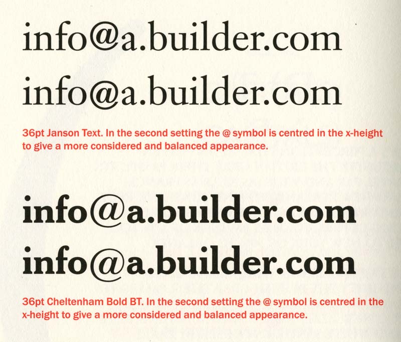
The second one is this picture. Wouldn’t you want to consider changing a font for the @ sign before repositioning it? There are many fonts with @ signs that were imported from generic character library in the early digital era, so it’s worthwhile to look for a better @ that harmonises with the text font, or simply not use such an old font.
The third one is fake bold, a pathetic, inexcusable mistake. If you are using Adobe CS (which is most likely the case with the author too), this doesn’t ever happen by accident because it requires very different operation than choosing a bold font. So he intentionally did it.
Font use
It seems that the author’s font library has not evolved for at least two decades. I am not blaming that he is using old typefaces, but fonts. Swiss 911, Gothic #13, Humanist 521, Zurich, Modern 20, with ‘Expert Set’, those kind of things (at least he does not pretend to use Univers or Gill Sans, but he does not refer to the original names). He does not explain how to use ligatures, small caps or proportional numerals (instead he kerns them) but as the caption indicates, he uses expert sets, which is (or should be) totally obsolete in today’s typography. In the glossary section, he explains what the expert set is, but no OpenType. I imagine advertisement typographers do not have to use OpenType features as the text they deal with is much shorter than that of book typographers, so the manual alternation and adjustment is not a hard job, and this is probably why he uses Bitstream fonts so often, whose good drawing quality will reveal at a large size. Nevertheless, I would rather encourage the users to learn more about OpenType.
All that said, actually there is one thing I learned from this book, which is the Cogent setting. It is basically a semi-justified setting, which justifies only the lines that almost reach the line length boundary. It was a technique preferred by Cogent Elliot, an UK-based advertising agency (hence the name), so naturally the young Japanese designer had never heard of it before.
There you have it. This book looks pleasing enough so you want to get a copy of, but teaches you wrong things. Whether you have read it or not, I hope you are wise enough to avoid it or enthusiastic enough to try other books, such as Detail in typography by Jost Hochuli or Elements of typographic style by Robert Bringhurst. It’s not that I trust them wholeheartedly, but they will give you a much better picture at cheaper price. As a final word, I’ll give a message to the author with a quote from Yoda; ‘Much to learn, you still have.’
Okay, here’s my nitpicking of (some of) its glossary.
Blackletter: A mid-15th century typeface based on northern, Germanic manuscripts of the time.
It’s certainly not a typeface nor typeface category. It’s essentially a calligraphy style. The author seems to refer to Gutenberg’s type, but obviously blackletter has much longer history.
Bleed: The arrangement of pages so that the printed area extends beyond the trim of the page.
Why do you explain that? It’s completely out of place.
Body: In hot metal, the metal block that carries the printing surface of a character. It is the depth of the body that gives type its point size.
First of all, the use of hot metal is wrong. It only refers to machine-casted types which a typesetter could use them while they were still hot (the author makes this mistake everywhere). We don’t call body height a body depth, do we? And it doesn’t only give its size in point but any kind of measurement unit.
Clash: The striking of one letter against another.
Why do you have to explain such a normal word? Some call it touch, others call it collision. It can be any term that gives the same idea.
Colour: The visual blackness created by a body of type on a page or screen.
As the author said above, body is a type block, and of course it doesn’t create blackness. The face of a type does. However, face is a printing surface of a type and irrelevant in computer typography. Letterform would be more suitable, but not in his book, because,
Letterform: An individual character or glyph.
WRONG! Letterform is the form of a letter!
Kerning: The reduction of white space between two characters (inter-character space).
It’s also an addition of letter space.
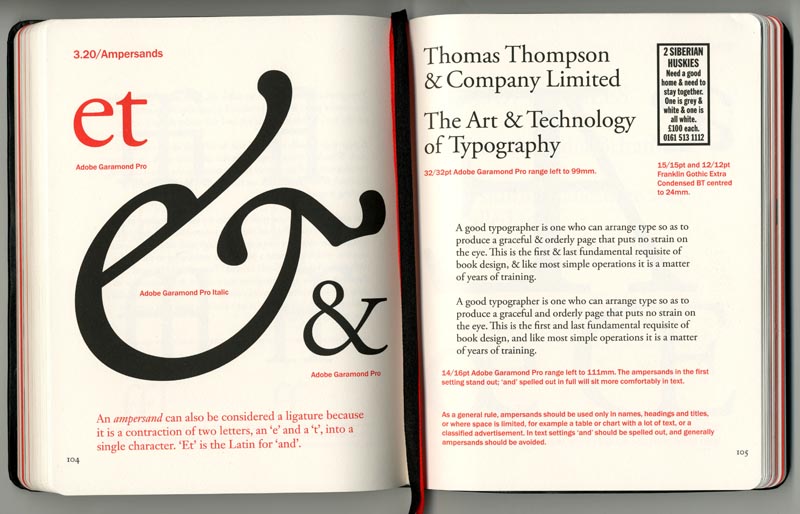
Ligature: A contraction of two or three letters crafted into a single character or glyph.
A ligature can be made from any number of multiple characters. For example, Jonathan Hoefler made an fffl ligature in Requiem for German use, and František Štorm likes to make an offi ligature (see the PDF specimen of Bhang).
Lowercase: The non-capital letters of a typeface. The term is derived from the setting of hot metal type…
Non-capital letters includes so much more than the author thinks it does. Also the use of hot metal is perfectly wrong this time. Hot metal technology does not require a type case.
Display type: Type that is set larger than surrounding text, for example headlines in press advertisements.
Then any typeface used in big sizes is a display type (Is Arno Pro Caption in 100 points a display type?). Poor choice of words.
Point system: The point is the standard unit of typographical measurement, where 72 points equal almost 1 inch – actually 0.9962 inches.
Looks like he hasn’t updated his knowledge after he was taught about it in his youth. He doesn’t mention that there are several other point systems, and explains only the one he knows. By the way that American point system is not used anymore (except by metal type foundries and printers) and the 72 points in DTP point system does equal to 1 inch.
Roman: Any typeface that stands upright, rather than being italic or backslanted.
In his world, Times New Roman Italic cannot exist. But seriously, is that all you have to say about Roman?
Swash: A decorative, flourished version of a standard letter, usually italic and capital.
Swash is a stroke, not letter.
Orphan: A single word, a very short line or the tail of a hyphenated word at the end of a paragraph that appears on the top of line of the following column.
That’s WIDOW.
Widow: A single word, a very short line or the tail of a hyphenated word at the end of a paragraph.
That’s ORPHAN according to Chicago Manual (orphan is essentially the first line of a paragraph at the end of a column or page).
x-height: The height of the body of a lowercase letter.
Then that covers the height of any lowercase letter. It should have been much easier if he explained why it is called x-height.