Ullstein Fraktur, the unknown geometric blackletter
2013年04月09日
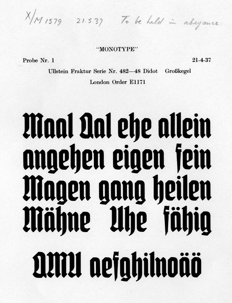
While I was digging through the Fraktur stuff at the Monotype archive last week, I stumbled upon this rather nice fraktur typeface called Ullstein Schrift, series number 482, marked ‘To be held in abeyance’ in the specimen.
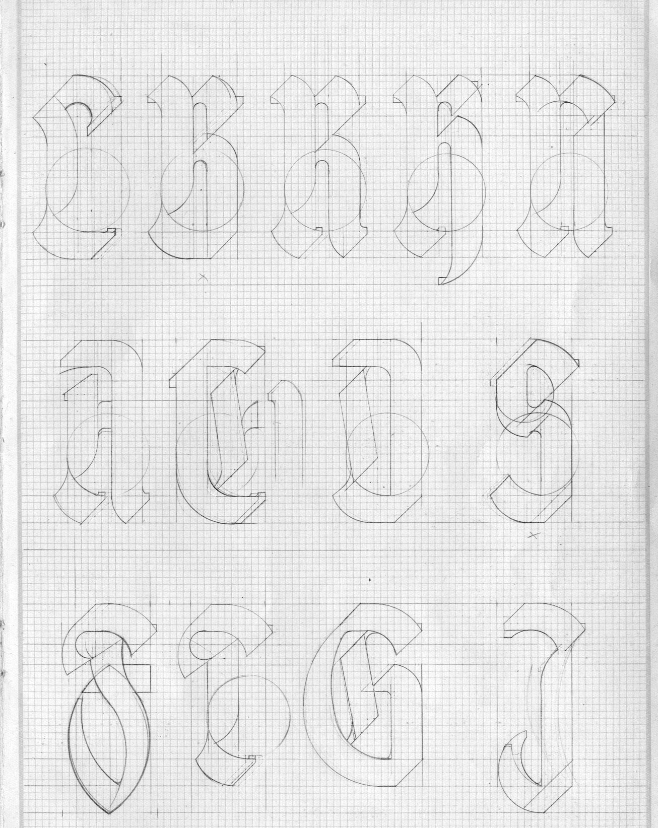
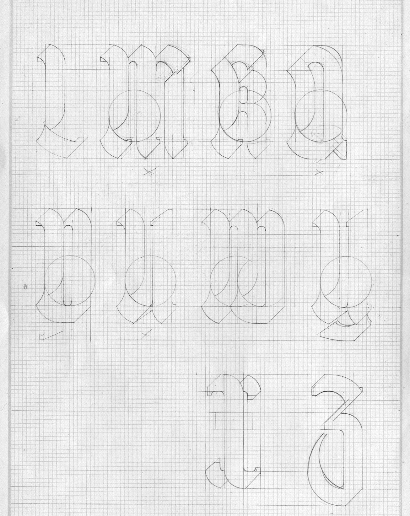
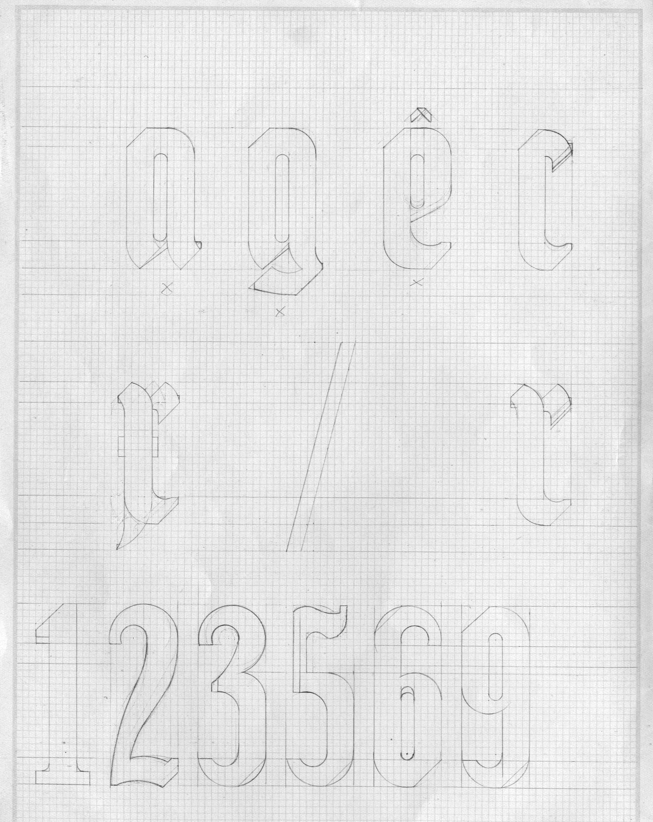
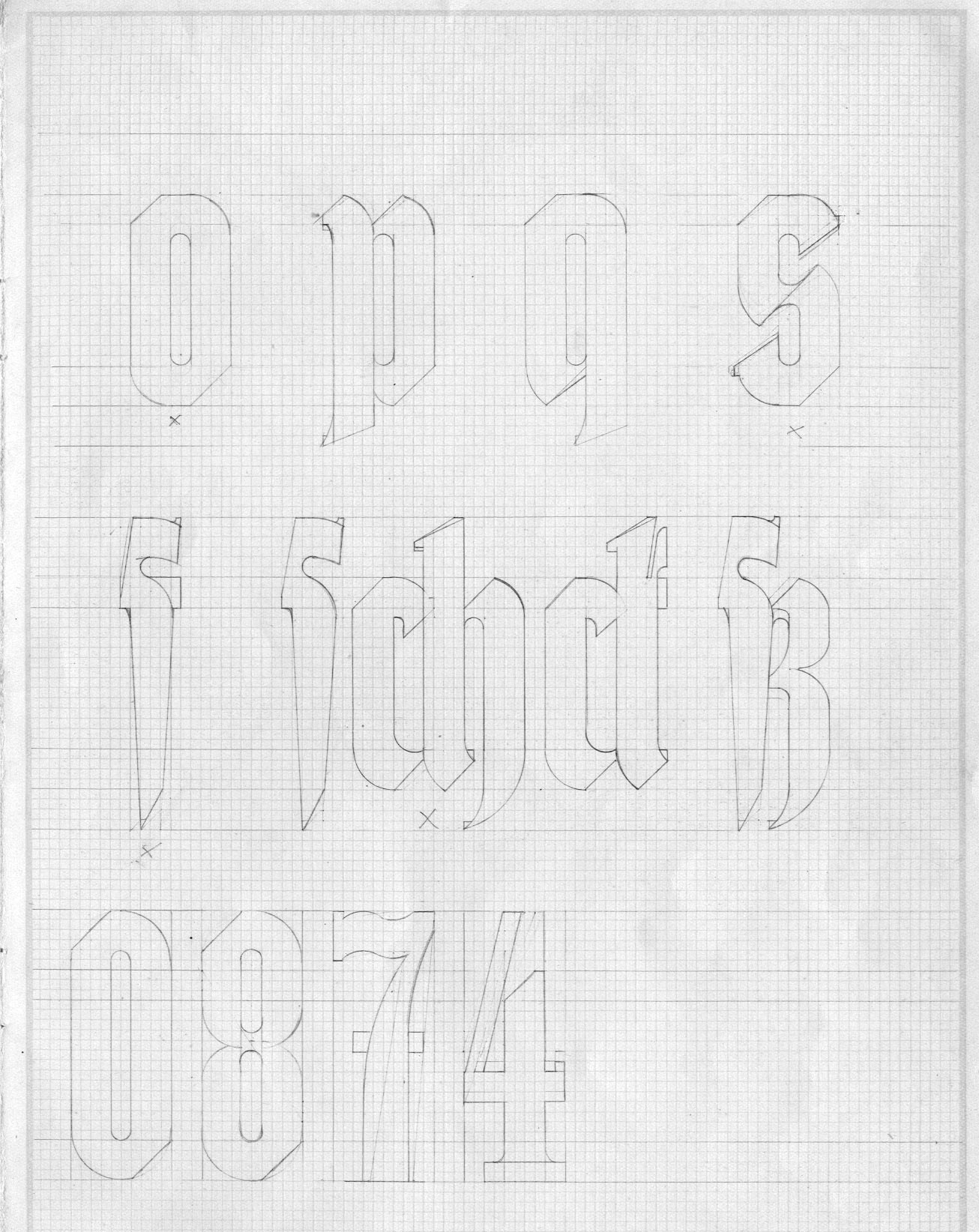
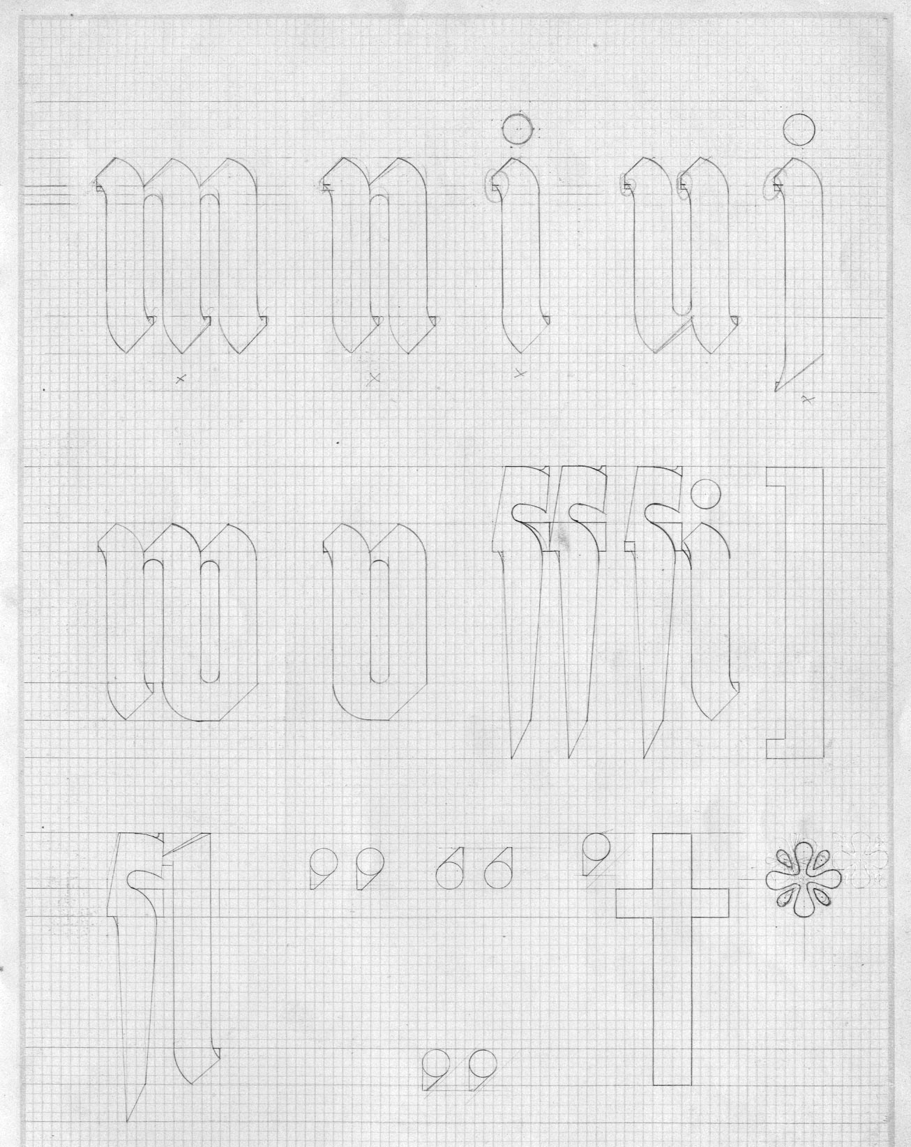
I wondered why such an interesting blackletter had to be abandoned and wanted to see what remains in the pattern drawing box. To my surprise, Ullstein was a geometrically constructed typeface!
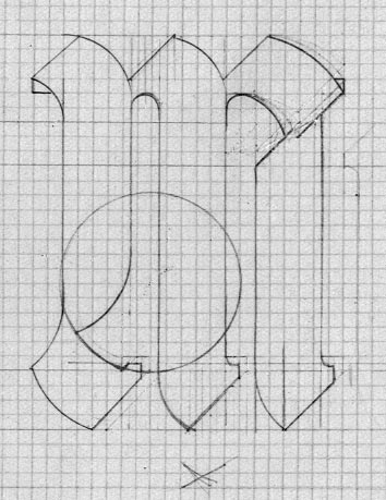
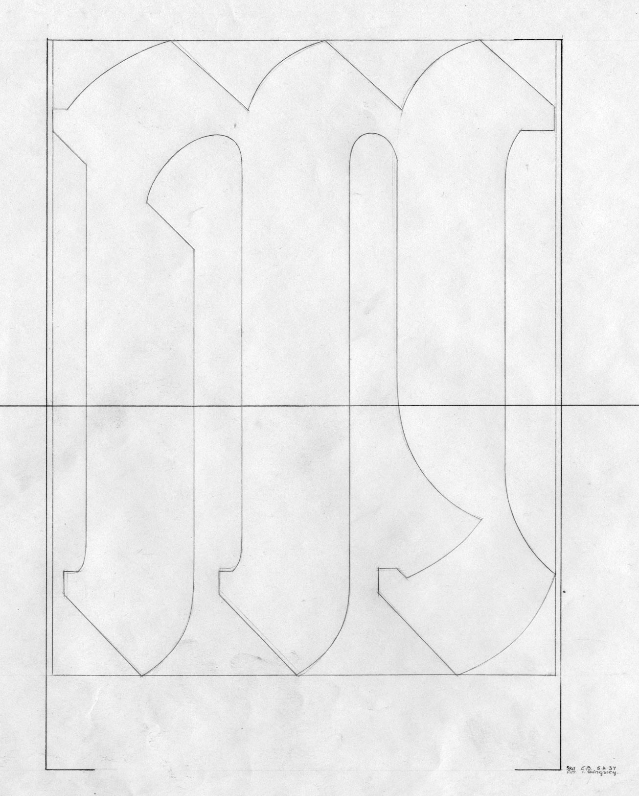
Looks like all characters are at least drawn on a grid paper, but not all were made into pattern drawing. I haven’t checked the production note* yet so I do not know what actually happened, but soon after I saw the drawings I understood the reason why it was cancelled, if it was because of design. First of all, the grid is very fine, and the designer even subdivided it wherever necessary, so much so that it was pointless. Secondly, the pattern drawing, the production drawing from which the Monotype matrices would be made, incorporates so many optical correction. For example, the sausage-shaped counter of lowercase letters is not a mere combination of circle and rectangle; it was carefully softened by the drawing office (it’s not a bad decision at all, in fact it’s a pretty basic stuff even today). So, the designer(s) might have realised that there was no point in continuing the process.
* Production note: written record of typeface production kept by the drawing office. Typically it notes which character was drawn at which time, what was approved and rejected
Blackletter faces for Monotype machine were usually done at Monotype German office (Weimar?), of which whereabout of the drawings is unknown. Ullstein Fraktur was among the exceptions that were produced at Salfords. Curiously, Berthord Wolpe’s Sachsenwald, series 457, was made almost at the same time (1936–37), and its proofs and approval letters mentioned Mr Ullstein, as well as Wolpe and Stanley Morison. I do not know anything about Ullstein (not even his given name), but at least he was involved in two Monotype blackletter projects in UK. He might have been a blackletter specialist at Monotype or just a customer.
Update 14 April 2013: The Monotype Continental office was located in Frankfurt though I randomly said Weimar (I shouldn’t have done it). Also I confirm that the Ullstein project was indeed cancelled (the last note ends with something like ‘Sent proof to the customer. Do not continue until we have an approval’). I also discovered that there was another Rotunda project commissioned by Ullstein being developed at the same time, which was completed (series 483). So, Ullstein was involved in at least three blackletter projects. While it is interesting to find out why, but I am more interested in that Rotunda project whose capital in particular looks like Wolpe’s, although there’s no written connection between him and the face.
I rest my case. Now, feast your eyes!
Designer’s drawings
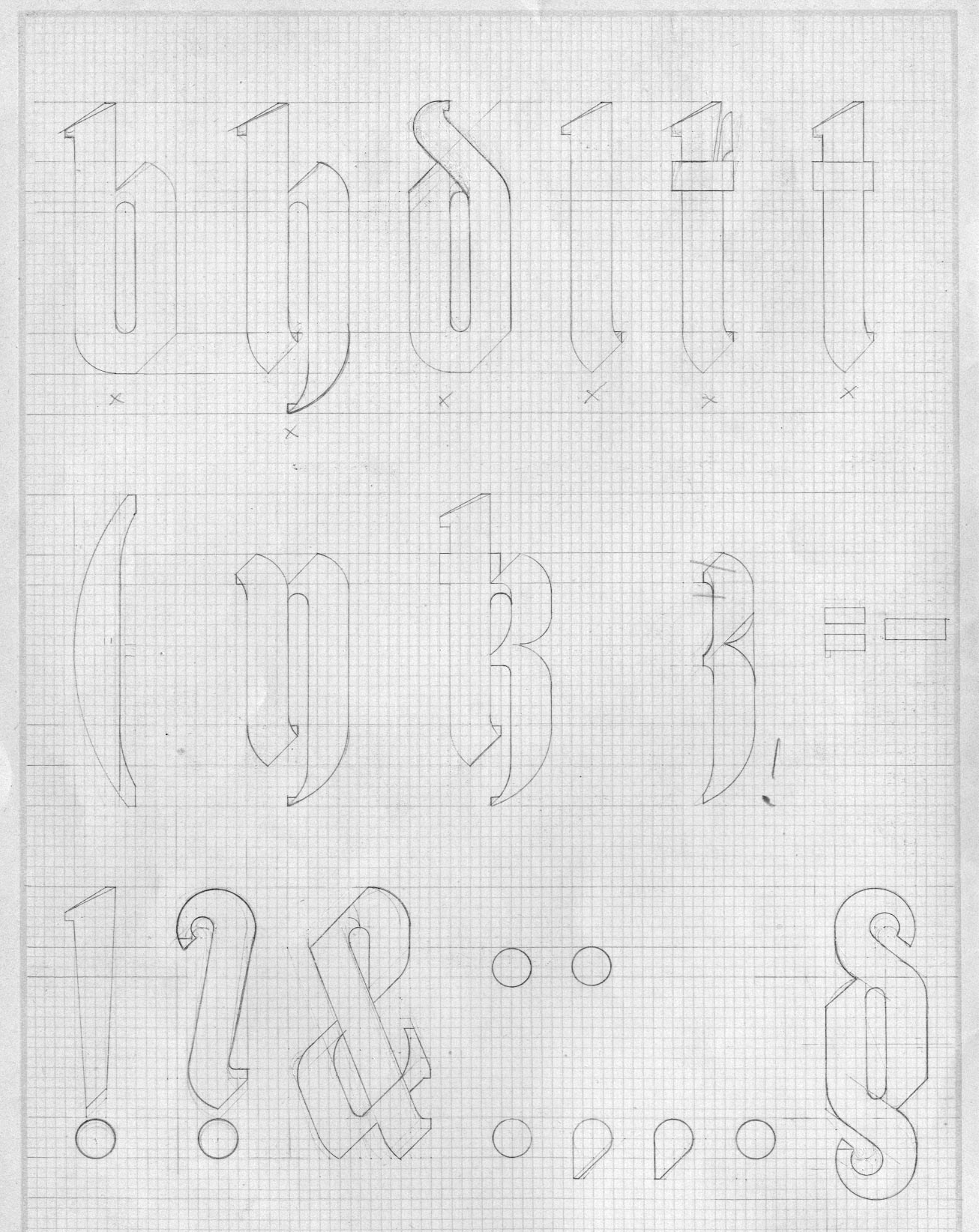
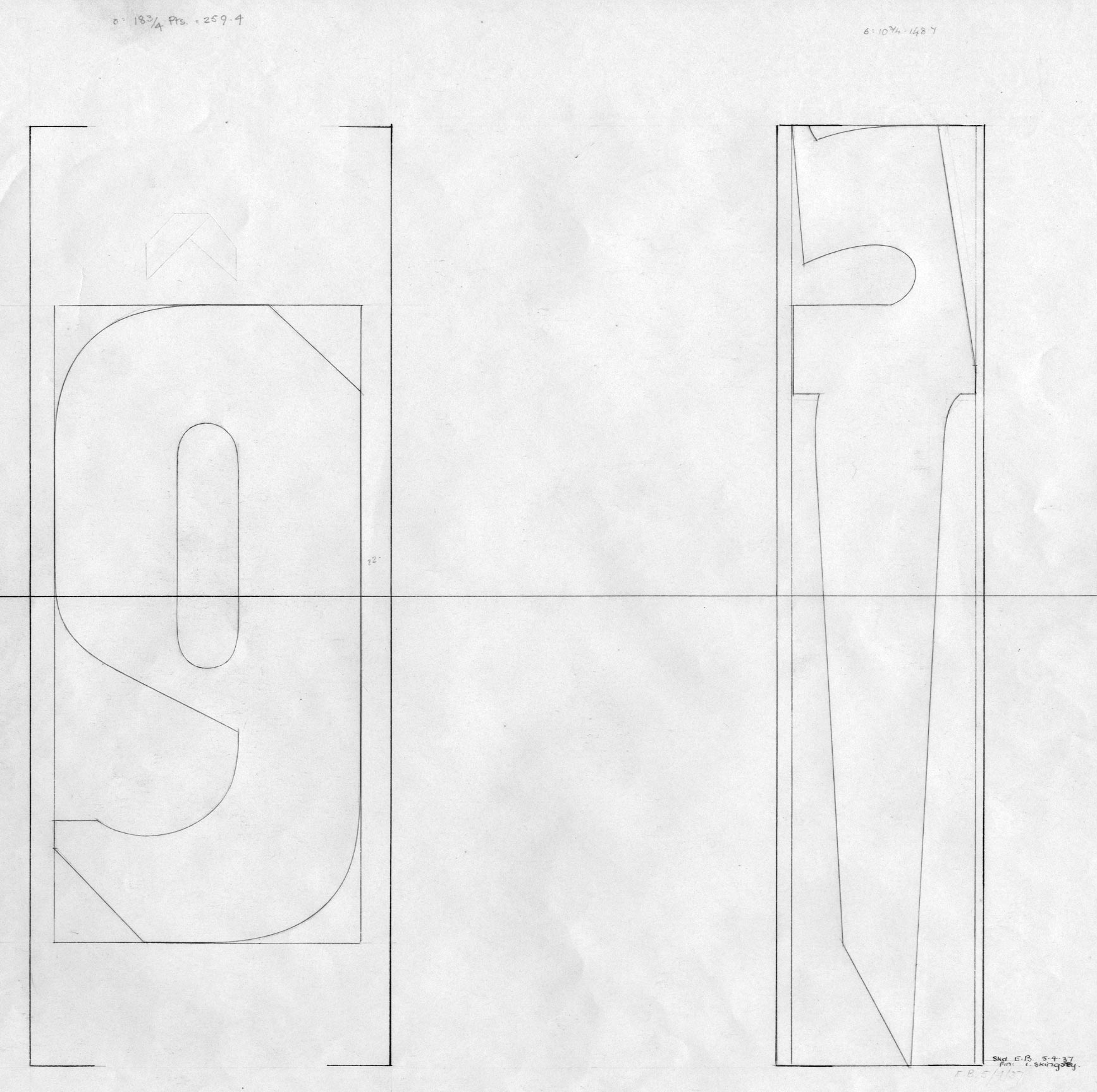
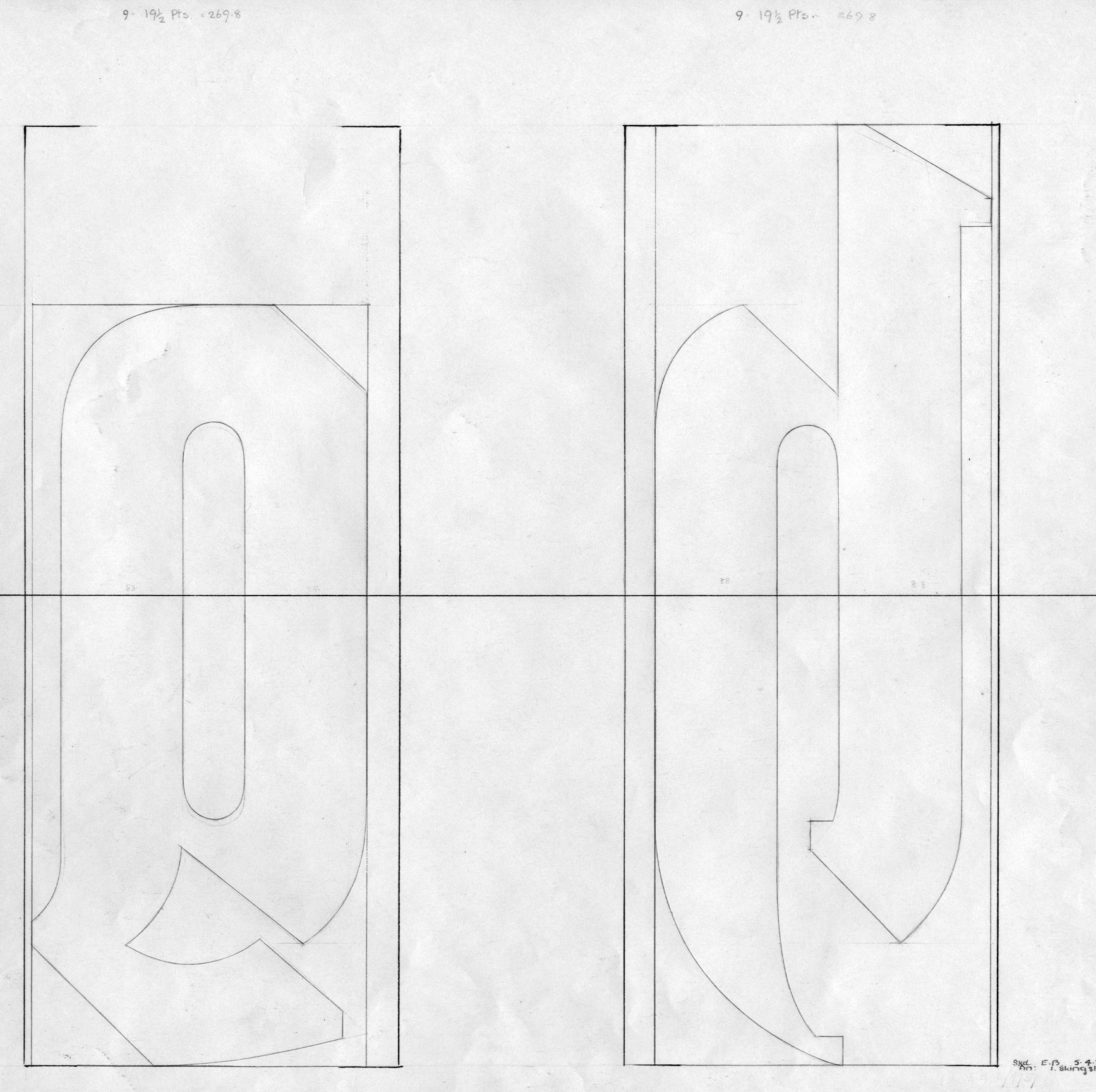
Pattern drawings
(Just a few so that you can see how the original drawings were translated. Of course they were drawn in reverse.)